Weekly Forex Recap – AUD/USD – 20141227
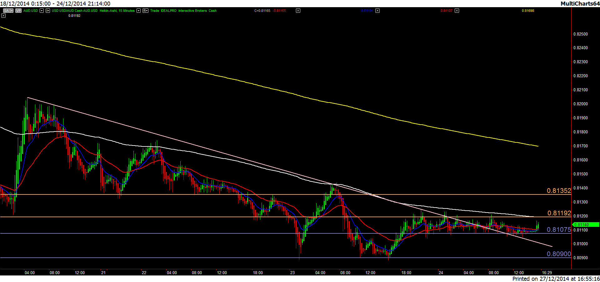
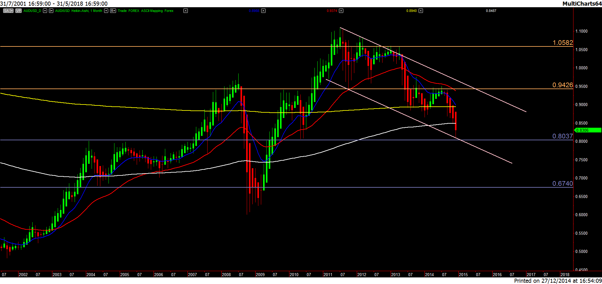
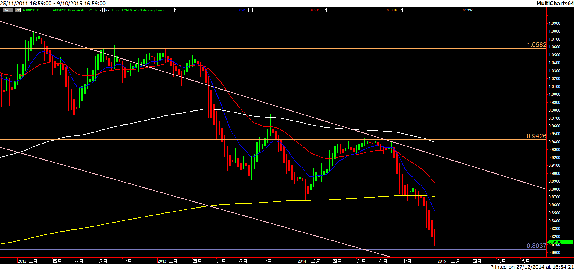
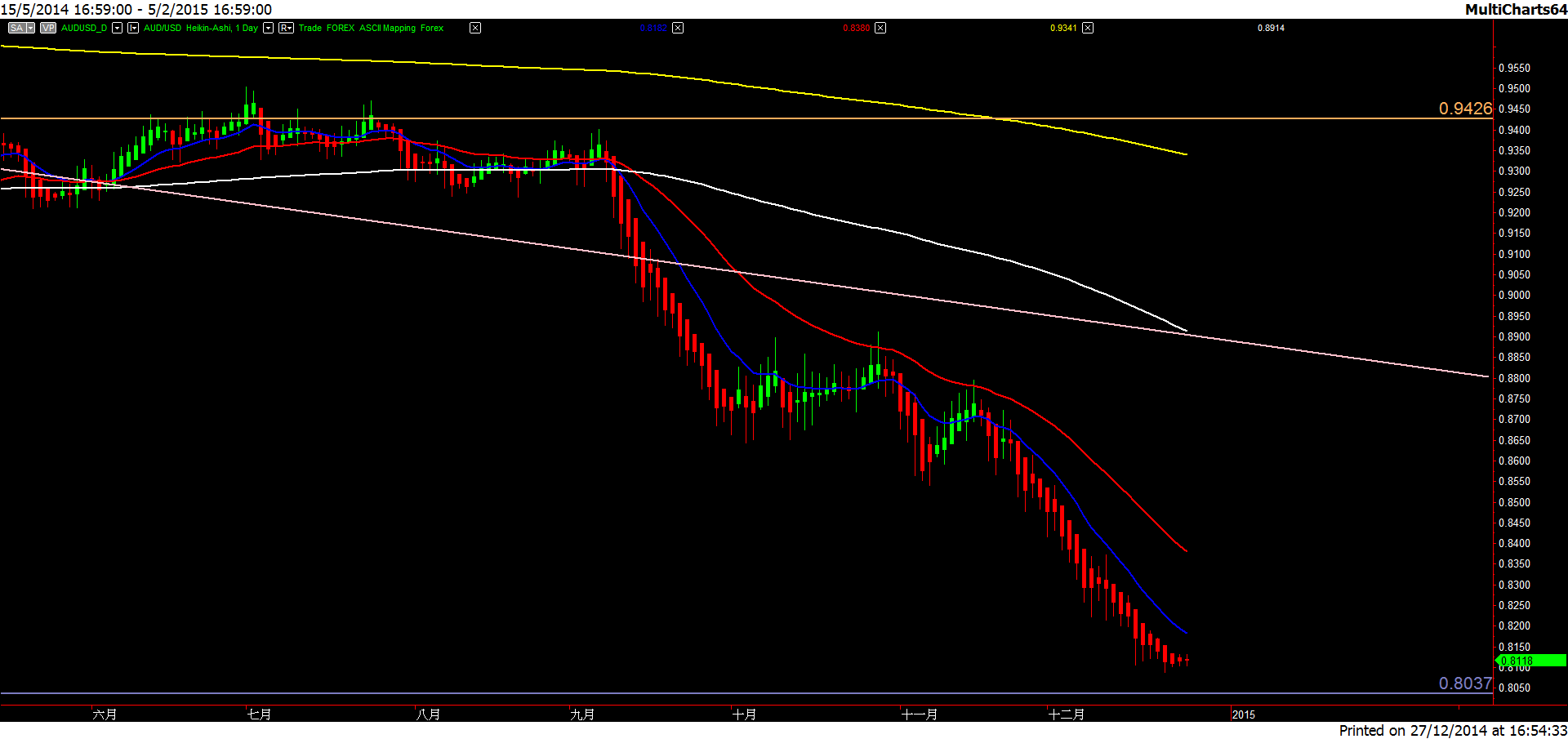
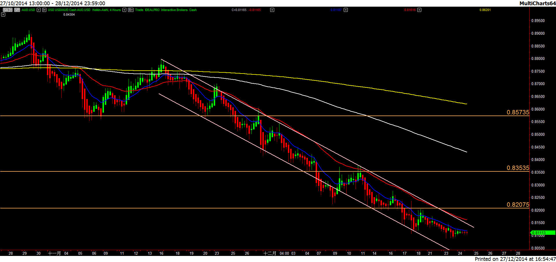
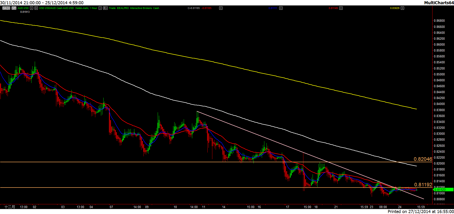
All charts are based on Heikin Ashi (not classic candlesticks) annotated with FOUR moving averages of different periods (blue is the fastest, then red the second, then white the third, and the last is yellow). Moreover, the horizontal lines in orange are important resistance levels while those in purple support levels. Some charts also have pink trend lines or channels marked over.
Remember the reading sequence is from the slowest to the finest according to the top-down approach.
A very appealing visual aspect of Heikin Ashi is its intuitive trending system, for example, a steak of green candles means an uptrend whereas a series of red candles represents a downtrend. Therefore you may just recognize if green is more than red or vice versa to know the trend of the wave.
If you watch out the interaction among the prices, the red and blue moving averages, you see that there are MANY kiss-me-goodbye type of trading opportunities.
Monthly Chart
Weekly Chart
Daily Chart
4-Hour Chart
1-Hour Chart
15-Minute Chart